Wednesday, March 23, 2022
A Hybrid's Tale
Saturday, March 19, 2022
A Hybrid’s Tale
Soon, My Precious . . . Soon!
As we draw closer to the release of “A Hybrid’s Tale”- the
first book of the Cambion Journals series, I thought I’d give you a bit of
background information regarding the Cambion logo itself; what inspired its creation,
and how it evolved from there. And my reasons for this are simple. There are
certain elements that went into its composition that you, the reader, will come
to know and love as the series develops.
The first feature we’ll look into is something I’ve already made
reference to, on both the Cambion Blog & Facebook pages: the threefold bloodline.
A Cambion is a supernatural hybrid. The culmination of crossbreeding the inherent legacy of a fallen angel, a Succubus or Incubus, and a human, resulting in an unholy fusion and arcane augmentation of the potential that all three races possess.
Now, when I first wrote the Cambion Journals, I devised a logo to represent that heritage. And some of you may remember my original concept, in which the three races are represented by a cluster of circles, divided by the broken chevron.
Yet, as much as I liked it, I wanted something more. Something special. Something with panache. So, I approached a friend of mine – Roy Mauritsen – who some of you will recognize as the cover designer for a number of my other books, to help out.
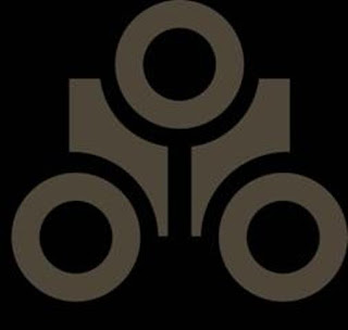
Creative wizard that Roy is, he took a look at my idea, and came up with THIS!
Can you see what he did, especially the trio of faculae orbiting the central band? Those extensions symbolize the fire that burns within each of the races concerned. And the central ring? That represents a Tau-rus gate, the means by which the demondim navigate between their conclaves and cities. The Tau-rus is a wormhole network powered by the furnace of Tartarus, (as depicted by the flame in the middle of the ring), the unholy byproduct of warped Holy Spirit, engendered during the rebellion and fall from heaven. As you will come to learn, Tartarus is also the prime source from which the demondim gain their stygian majesty.
If I had to use one word to describe that logo, it would be: Yuuuuuuuuuuum!
Now, as all authors will tell you, when you’ve put a lot of
time and effort into creating something, you kinda cross your fingers – and everything
else – in the hope that the publishers who eventually take your work on will
also be interested in the little bits-n’-bobs you devised that make it sparkle.
And in my case, I’ve been blessed!
I’m mightily relieved to say that the team at Raven Tale was an
absolute delight to work with. Not only were they kind enough to want to publish
my series, but they were also willing to adopt the logo, and – after adding their
own particular stamp & magical flair into the mix – have incorporated the Cambion logo into the
cover art design.
I received a mock concept for “A Hybrid’s Tale” just the other day. A concept that will be used to brand and identify the entire series.
And please excuse my obvious bias, but it is absofu**ingloutelys**toffashovelglorious!
I can’t wait to share it with you . .
. but wait I must. The final tweaks, polishing, and ever so gentle buffing with
a soft cloth is taking place as I type, to add that final sparkle.
And sparkle it will.
So, stay tuned for more details – as and when they crest the horizon.
Or, if you’d like to find out what else Raven Tale has to offer, just take a
look at their current listings. There’s something there to chill the darkest
soul.
Raven Tale Books
Why not dive in and indulge yourselves?
-
Are YOU Afraid of the Dark? You Will Be A Hybrid’s Tale Born a Cambion – a half-demon, half-human hybrid – and cursed by a terrible ...
-
The Cambion Journals Do YOU want to believe? Believe in things that simply shouldn't exist? Do YOU like your Urban Fantasy to be delici...
-
Review - A Crown in Peril Book 5 of the Cambion Journals Gotta say - I l-o-v-e this latest review of A Crown in Peril 5.0 out of 5 stars E...


